Saturday, November 23, 2013

Friday, November 22, 2013


Tuesday, November 19, 2013


I would really want packaging to be more eco friendly. When you open a package of pens from pic so much is thrown away. Not many people remember to recycle so most of there packaging is thrown away. If there was functionality to the products packaging people would be more likely to keep it and store it. I want to use BIC's eco friendly products to create a school supply reusable storage box.
BICs eco friendly supplies: Ecolutions
White Out https://www.bicworld.com/en/products/details/138/ecolutions
Pens https://www.bicworld.com/en/products/details/63/ecolutions-round-stic
Pencils https://www.bicworld.com/en/products/details/247/ecolutions-evolution-eraser-655
Post-its https://www.bicworld.com/en/products/details/415/ecolutions-notes
Monday, November 18, 2013


Packaging
I this good product pakaging should follow these guidelines:
Easy to store
Not much excess waste after unwrapping the product
The product dpoesn't leave much excess waste
Look Good to the eye
I think these are some examples of great pakaging by products and especially the stores. You can conveniently see what the product you are purchasing is, with an easy way to grab it.


Also this glade candle is packaged perfectly for what it is. The sent holes look cool and are functional with limited use of paper or plastic. 
Wednesday, November 13, 2013
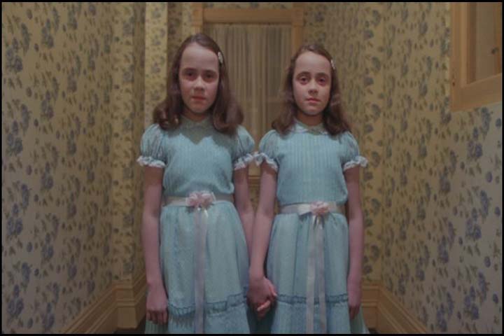
the shining artist statement
The Book by Stephen King titled The Shining is a very
ominous novel. It is about a man
and his wife and child who move into a haunted hotel to take care of it over
the winter break. Jack, the main
character, is a writer. He believes this job opportunity will give him time to
be peaceful and just write. This is what inspired my book cover theme. After
going through a few other sketches of trial and error, I finally went back to
my first sketch idea of a typewriter. I wanted a subtle creepy feel to it. The background
seems like lovely wallpaper you’d find at your grandmothers house along with an
old typewriter, but there is something off about it. I wanted the blood not to
be in your face but still convey a very dark and grotesque image. The title is
meant to look like it is placed on a plaque you would find in a hotel with the
room number inscribed on it, adding to the elegant feel.


Tuesday, November 12, 2013


Thursday, October 31, 2013


Saturday, October 5, 2013


Subscribe to:
Posts (Atom)